
Ecommerce and Retail • Ecommerce Design

UX (User Experience) is at the heart of every good design. It’s the difference between your customers groaning in wretched frustration, or grinning with enjoyment; with them shaking a defeated fist at your site and hastily clicking away from it, or completing a satisfying purchase and wanting to return for more.
UX is about putting the customer first - who would be a more suitable candidate for the pole position? Your ecommerce store is for them, so it should be designed for them. They’re the person who you want to satisfy the most, and engaging in UX allows you to accomplish this. It can help to turn your site from a means-to-an-end, to a steamrolling ecommerce powerhouse. In a cutthroat global economy with ruthlessly fierce competition, your site absolutely must stand out in order to excel. UX is a tool that can help you achieve this.
Though complex in nature, UX doesn’t have to be expensive. We’ve hand-picked a few of the most cost-effective UX practices that can make a big impact on your webstore and that you can start using right away!
Every element and word on your webstore needs to be absorbed and understood by your users. This is called cognitive load - the mental effort being exerted by the user’s working memory. The more cognitive load that you burden your users with, the more stressed and discouraged they’ll become. This is why it’s essential to seize your proverbial eraser, and remove everything that is unnecessary from your webstore.
Pioneering UX professional Steve Krug advises the following:
Get rid of half the words on each page, then get rid of half of what’s left
- Krug’s Third Law of Usability
Using concise language is one way to reduce cognitive load and speed up the user’s journey. It’ll also reduce the noise level of the page, make your important content more prominent, and result in each page being shorter.
“Happy talk” such as “Welcome to our webstore” should be avoided at all costs. The primary reason people come to your site is to purchase goods and this kind of unnecessary fluff just serves as a hindrance. Consider removing gratuitous pronouns like the “Our” in “Our products”, or the “My” in “My account”. Try to re-write any sentences that might be just a tad too overinflated and wordy. With a little effort, you’ll end up with a more succinct site.
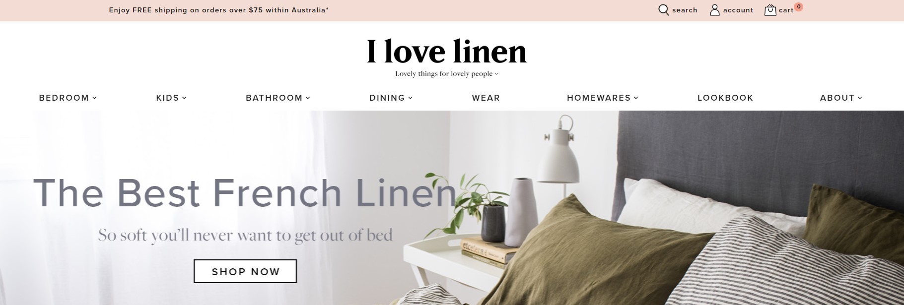
Your webstore isn’t primarily a blog; most people aren’t arriving at your site with the intention of filling their heads with knowledge, they’re turning up to make a purchase. Over 20 years ago, usability god Jakob Nielsen discovered that people don’t read websites, they scan them. You should keep this top-of-mind whenever writing or reviewing copy for your website.
There’s many UX aspects involved in creating a scannable ecommerce site, with four of the best being conventions, gestalt theory, well-formatted text, and visual hierarchy.
Being conventional may be considered dull and unoriginal by some, but it’s a fundamental part of a good design. Elements that adhere to convention are instantly understandable, and so require little cognitive effort. This means that you should think twice before including a whacky, animated “Add to cart” button on your webstore, or a navigation menu that just uses icons because it looks super-cool.
Users don’t want to mentally strain their way through the shopping experience, they want to make purchases as quickly as possible, and then get out of there. Using conventional elements throughout your design will give it a comfortable, recognisable facade. You can suffuse your site with originality using shape and colour; leave conventional elements such as search, navigation and forms to their effective predecessors. They were designed that way because they work.
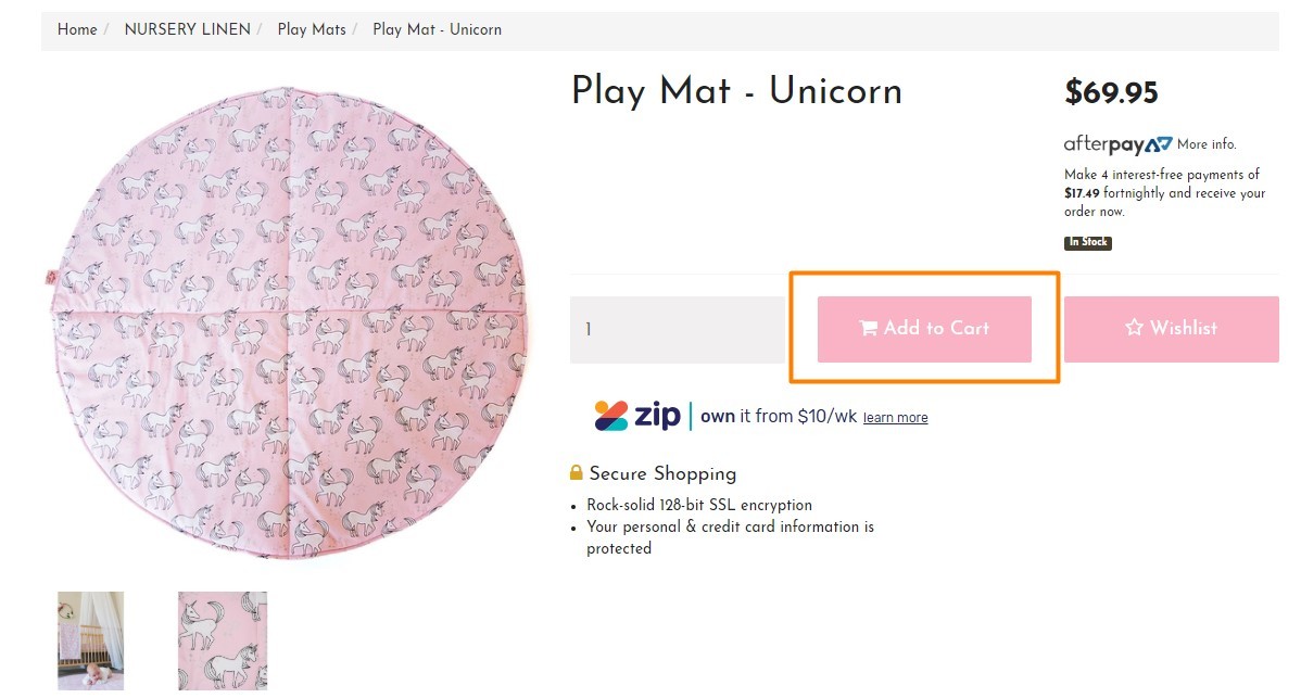
Gestalt theory is a complex psychological theory which explains how we perceive the world, but for the sake of UX, it’s a principle of proximity. A simplification of this principle is as follows: things that are close to each other, similar in design, or enclosed within a border are understood to be related.
This is the reason that designs with little whitespace tend to baffle us - we just can’t figure out how to separate the content into manageable and understandable chunks, because it appears to be one gigantic mesh of information. Using ample whitespace, or placing a border around your elements, gives each section a unique identity and clear purpose, allowing your users to easily distinguish and navigate your webstore.
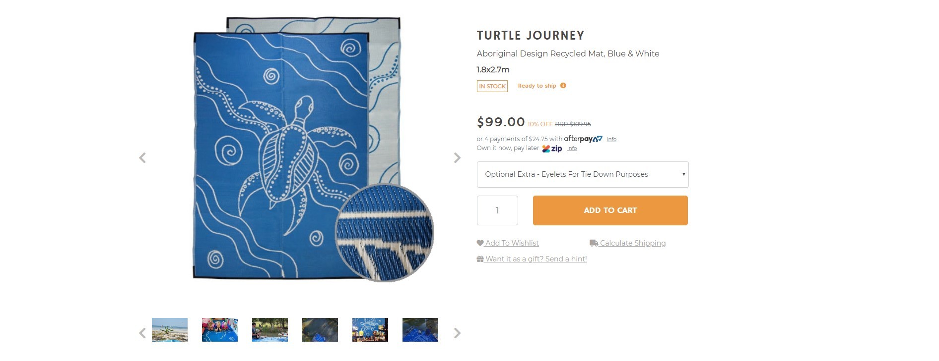
Well-formatted text will enable your customers to quickly find the information that they’re seeking. This can be achieved by using concise, large headings to group information (Gestalt theory again); short, quickly-consumable paragraphs; bullet lists whenever possible, and the highlighting of key words. Lists of links should include the most important and relevant words first.
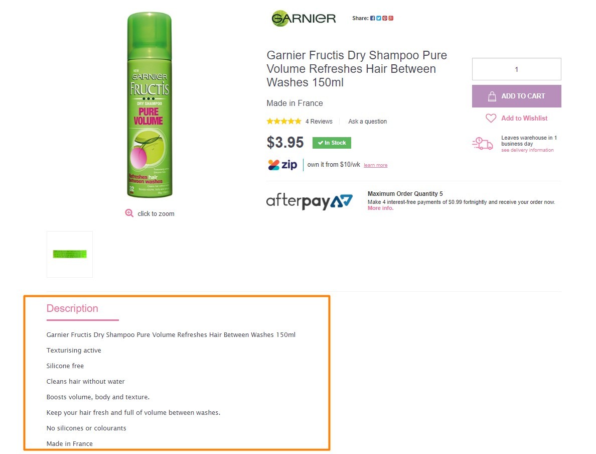
Visual hierarchy is a scale of importance, it illuminates where your attention should be focused, with the option to consume less important content if desired. The more priority something has, the more prominent it should be.
Importance can can be increased using size, weight, colour, or additional surrounding white space. A classic example is colouring your “Add To Cart” button with a hue that stands out in your webstore - painting it the same shade of blue as your header background just means that it’s less likely to be spotted, with potentially expensive consequences. Similarly, a product’s name is more important than its description, so using the same font size for both is communicating that they have the same priority. Good visual hierarchy encourages your customers to focus on what they should be focusing on.
The most UX-savvy design team in the world can’t anticipate a user’s every desire or action. Every one of us is beautifully unique, and our behaviour exhibits this fact. With A/B testing, you can present different customers with two slightly altered designs, in order to determine what works best for their particular nuances. A simplified example best illustrates this:
Test name: “Complete purchase” button on checkout
If we want to understand which text on the button at checkout performs best we would test two variations:
Design 1: Button uses the text “Complete purchase”
Design 2: Button uses the text “Complete sale”
Conversion goal: Clicking on the button and completing the sale
Randomly displaying the two different designs to customers over a period of time will help you to determine which one converts best.
A/B tests can be set up with Google Analytics or Crazy Egg, both of which are available to install for free in Neto’s add-on store.
UX doesn’t have to be time-consuming or difficult. With the above practices, you can make radical improvements to your webstore’s design, which will enhance the overall experience and increase the likelihood of purchases. Guide your customers effortlessly through your webstore - make UX a primary focus.
Want to learn more about UX Design? Keep reading: Inspiring Ecommerce Websites Part 2 [UX Design Examples]