Ecommerce and Retail • Ecommerce Design

If you run an ecommerce website in 2018, it's essential that you optimise every element of your online store. Not just your homepage, email opt-in or meta-descriptions, but – most essentially – your product pages. Sellers must get this right to get in the game and remain competitive.

Think of it this way. Imagine if you had a bricks-and-mortar clothing store in Westfield. Even if the storefront and fit-out (aka the homepage and website design) looked slick and inviting, browsers would leave pretty quickly if the merchandise was sloppily presented and staff couldn’t tell you much about the range.
It’s the same with ecommerce.
Having beautifully optimised product pages makes it easy and a pleasure for browsers to load up a cart and follow through with their urge to purchase.
Here are 5 easily achievable product page tweaks to optimise your conversions.
A huge part of product page optimisation is showing your merchandise in its most flattering light. For best results, product images should be shot on a white background with good lighting from a variety of angles.
Our advice would be to feature 3-5 product shots, including one ‘in situ’ lifestyle shot that shows the size and application of the product.
Professional photography is a worthwhile investment. At a minimum, images should occupy 85% of the image and not have any text or watermarks on them. Don't have the budget for a professional photographer? DIY with these tips.
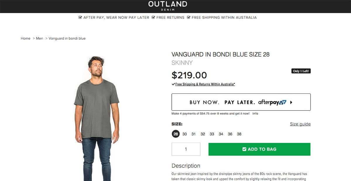
Outland Denim is a stellar example, with its range of pro-looking still life and on-model shots. Bonus points for the bold, clear ‘buy now, pay later’ option.

| Related Reading The Simple Way for Customers to Buy Now and Pay Later
In ecommerce, the bullet points that appear next to or below the main product image are crucial to optimisation – even more so than a detailed product description paragraph further down the page.
Best practice is to use these bullets to tell people upfront what they want to know about the product and any additional costs not in the RRP. This is where you can be upfront about delivery costs and timelines.
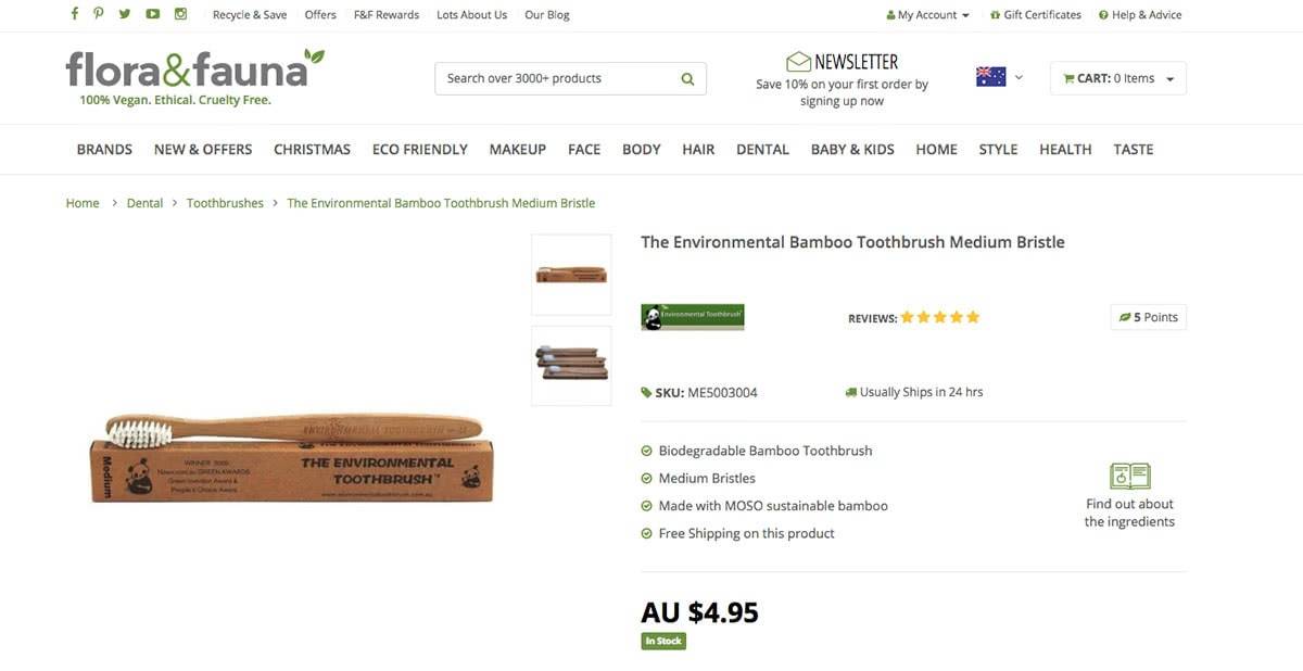
Flora & Fauna do bullets well here with their Environmental Toothbrush. They’ve made it clear that the product

You might want to list your bullets as follows:
Delivery info is one of the first things people wonder about when buying online. ‘So the price is XYZ, but how much for delivery?’ Many ecommerce retailers make the mistake of hiding delivery information somewhere down near their Ts and Cs. It’s far preferable to be clear about it on the product page.
While some people enjoy a challenge, when it comes to ecommerce it’s best not to make your time-poor, easily distracted visitors work hard for anything.
Make the ADD TO CART function as plain as day so people know in no uncertain terms how to buy. Now this may seem obvious, but you would be surprised how often the visual hierarchy is off.
Also, make it crystal clear that the item is IN STOCK, READY TO SHIP and include trust signals like a security verification rating and on-page reviews.
Aim for product titles that are concise-yet-thoughtful descriptions of the product and communicate key info to your target market in a straightforward way. As with anything in your ecommerce store, ensure title copy is grammatically sound, spelt correctly and accurately describes your product.
You also have to consider your target market. With some products, a short and sweet title will do, but with a niche item you may have to be more specific.
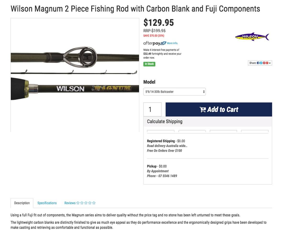
Hooked Online use the title to make sure customers know that this fishing rod is exactly what it says on the tin – a 2-piece rod made from high-quality components. Essential info to any fisherman worth his salt.
Below the title and bullet points, there is usually a longer, more detailed paragraph that more thoroughly describes the product. This gives ecommerce sellers the opportunity to capture a visitor’s imagination through the power of entertaining, relatable copy. If the product has a story behind it, by all means, tell that story.

When a potential customer arrives at your website, it’s essential to make a positive impression and persuade them to start shopping. And you only have a few moments do that. Never fear, we have small tweaks that can make a big difference to your bottom line. Here’s where you can read more about designing a high-performance ecommerce website.